I'm wondering if others are having this issue with the new scrolling asset action bar. We didn't know this change was happening and when it did we couldn't find all the buttons. The floating "action bar" is so much harder to see amidst our assets. To us, it makes much more sense to have the “add to collections,” “share,” “download” buttons in the same place as everything else users click on to sort the assets. In the attached you can see where it used to be versus where it is now. What do others think? Thanks!

Page 1 / 1
Even if it was just pinned to the right top instead of the middle bottom, that would be more intuitive for us!
The entire bar should be frozen and remain fixed when scrolling down, with only the assets themselves scrolling.

I totally agree keep it frozen to the top it just doesn’t look good like this. Why would you want this?

I don’t see any good reason for this.
The entire bar should be frozen and remain fixed when scrolling down, with only the assets themselves scrolling.
Yes it does, but the placement of it in the middle bottom of the browser window is an odd choice, not a place people look for it when everything else is located at the top. It’s confusing and hard to see when juxtaposed over the assets.
All they need to do is move it to the top, like this. When a user scrolls, I find that the middle screen row is what you're looking at. Or better yet, just make the action bar movable so users can place the bar where it suits them best.


Thanks for flagging all! As I understand it, this was escalated to support.
oh wait that floating bar, I didn’t have that before, I now see it..hmmm thought you guys meant the floating filter bar.. it was fine where it was..but I get that it was moved, especially with portals with lots of filters, we have plenty of room, but not entirely opposed to where it is now.. more bothered with the filter bar not being stuck to the top.
Yeah it took me a while to figure out what happened. Not a fan. I prefer it where it was as well. I find it is harder to see among the assets.
I've received some user feedback that has been mostly positive. Users appreciate the ability to access the download, share, add to collection, and asset counter features as they scroll through the assets. They find these functionalities more beneficial than the downside of the bar being somewhat difficult to see. As one user mentioned, "Once you know it's there, you know it's there."
Yes, I was on vacation — and to be honest, our users were a bit confused and didn’t notice it at first glance. For some of them, it took a while to figure out where it had gone.
I completely agree with
Hi everyone – Omri here, Group Product Manager at Bynder.
Thanks for the clear feedback on the floating action bar. Visibility is key, so we shipped a first round of fixes last week:
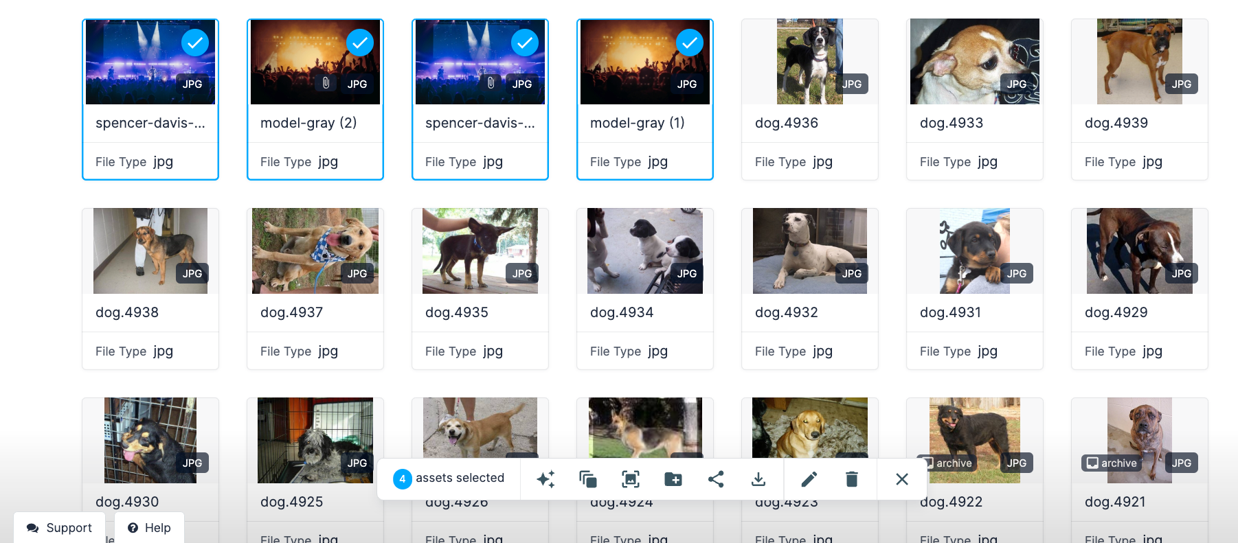
- Added a number badge that shows how many assets you selected. The badge uses your portal’s primary color, so it pops out more.
- Lifted the bar a few pixels, gave it a clearer border, added a soft shadow, and applied a light blur to the grid behind it for better focus.
Screenshot attached.
How is it now?
- Is the bar easier to spot?
- Anything else we should improve next?
I’ve logged other ideas you shared, like pinning the bar to the top or letting users place it where they like.
Keep the feedback coming, we are listening!
Thanks again,
Omri
Reply
Login to the community
No account yet? Create an account here!
Bynder Employee SSO
Bynder Employee login hereor
Enter your E-mail address. We'll send you an e-mail with instructions to reset your password.